Design Is How It Tastes
If our design specs only tell models what the interface is made of, they have already forgotten what the interface is for
Design is what happens to you when you encounter it.
Steve Jobs understood this in 2000. He stood on stage at Macworld, introducing Aqua, and said the buttons were so good you'd want to lick them. He wasn't talking about radii or padding or color contrast ratios. He was talking about sensory immediacy. The way a surface invites your hand. The way gloss makes you want to lean in. A good interface makes you feel something, and in to the interfaces that lived on our beige boxes at the time, Aqua felt viscerally different.
We've spent the twenty-six years since building increasingly powerful systems for preserving design decisions. Tokens, components, spacing scales, interaction states, variants for every breakpoint. Design systems are incredible at this. They keep teams aligned. They prevent drift. They encode intention into reusable grammar.
But they lose the felt reasons those decisions exist.
The Bloodlessness of Object-Language
A few months ago, Google Labs released DESIGN.md. The idea is sound: codify your design ethos in a single markdown file so that coding agents can implement it consistently. Write it once, ship it everywhere. Portability matters because interfaces are increasingly built by or with agents.
But read a typical DESIGN.md and you will find language like this:
Use 8px radii. Use a neutral palette with a pink accent. Buttons should have primary and secondary states. Cards should have subtle borders.
Useful, but thin. It describes the produced object. It does not preserve the intended encounter.
Good design absolutely talks about feeling, atmosphere, taste, mood, audience, pacing, the embodied experience of arrival. But that work gets compressed too early into machine-readable implementation language. The moment a design intent becomes a token, the temperature drops out of it.
I keep coming back to this distinction:
Object-language describes the artifact. Warm neutral palette. Elegant serif typography. Subtle texture. Soft cards. Generous spacing.
Encounter-language describes the experience of meeting the artifact. Stepping out of your car into a eucalyptus grove. The taste of the pacific air in Mendocino. Golden hour sunshine kissing your forehead. Copal smoke wafting through a mountain cabin. The page has already exhaled before you arrive. A room prepared for attention. Clarity without sterility. Intellect without deadness.
The second kind of language contains more design direction. It carries sensation, mood, pacing, social meaning, and implied structure all at once. A single sensory scene can encode color, spacing, contrast, materiality, ornament, and density without naming any of those directly.
It is precise along a different axis.
That is the layer design systems have trouble preserving.
Traditional design specs describe the artifact (you know the drill):
- palette
- spacing
- components
- typography
- radii
- layouts
- tokens
What encounter-language describes is the phenomenology of the encounter:
- what the page does to your breathing
- whether it cools or warms the room
- whether it sharpens, holds, seduces, steadies, initiates
- whether it smells like frankincense, wet eucalyptus, cold river stone
- whether it lingers after you close the tab
When Vibe Becomes Executable
Something shifted this spring. But to feel how big the shift is, you have to notice what hadn't been shifting.
Lately, everyone and their brother has a design tool startup. Code to canvas[1]. Canvas to code. Lift your design system into a different abstraction. Assemble components by yapping at your agent[2]. Useful, incremental, but not all that much has changed. The same primitives moved around the same board.
Then things started actually changing.
Pretext and HTML-in-Canvas opened doors to dynamic browser experiences that would have been impractical a year ago. New substrates for rendering, not just new ways to draw the old ones.
And diffusion models arrived, slowly and then all at once.
Seeing if image models can generate compelling visual design has been standard fare since the GAN era. But they just... kinda sucked. In writing this post I found some examples of diffusion web mocks I made in spring 2023: garbled text, poor layout adhesion, illustrations with six fingers. At the time it was the coolest thing I'd yet seen, but still unshippable. Even if you had something compelling, you still had to figure out how the heck you were going to build it. Most of the time you didn't. You couldn't!
But now you don't have to.
gpt-image-2 can generate high-quality websites, including near-perfect text. Combined with SOTA LLMs that can translate these to code, the gap between "I have a visual idea" and "this is a working interface" has collapsed from months to minutes. In 2023 you got a JPEG and a shrug. In 2026 you get a working interface.
And then there's Flipbook, which explores real-time generative design not as LLM-mediated specification of React components for a renderer to compose, but as a WebSim-esque hyperstition of any interface, delivered via video diffusion rather than DOM. We're a squint and a "hold my beer" away from discarding the "implementing the mockup" step entirely. Wild. Wild. Wild.
The web is on the precipice of much more vibrancy and art direction. Not just prettier moodboards. Something structural. Real-time generative interfaces that respond to users, designed for one person at a time.
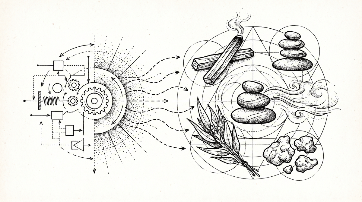
All of this matters because encounter-language used to be useless for machines. You could write "this page should smell like frankincense" in a brand deck, and your developer would nod and go back to adjusting border radii. The language of sensation lived in a separate room from the language of execution.
What changed is that diffusion models can now parse encounter-language directly. They don't need you to translate "frankincense" into "warm neutral palette with subtle texture." They understand the sensation and generate the form.
Vibe is becoming a programmable layer.
The Experiment
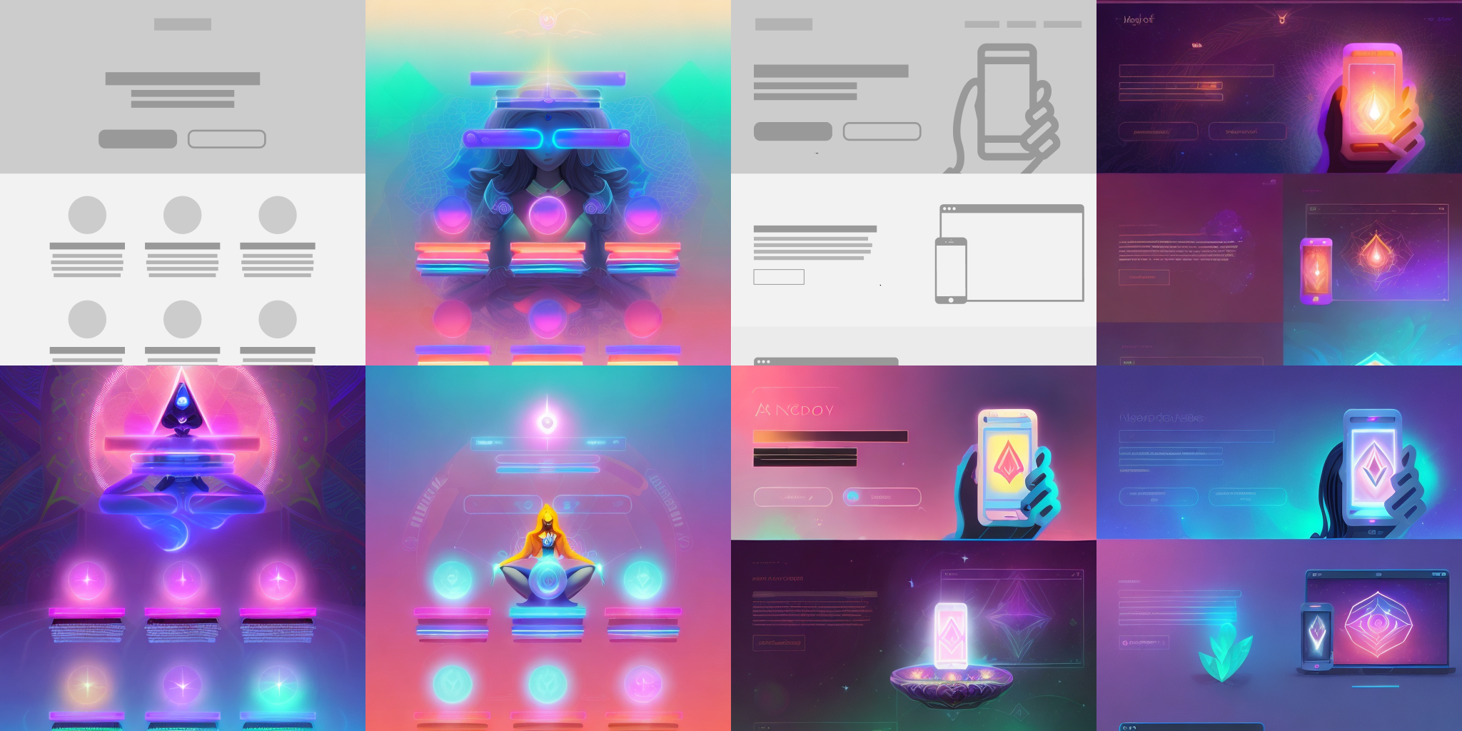
I've been veryveryvery busy this Spring. The Superposition website you're (probably) reading this article on[3]? Just me giving Opus the Manzanita Research design skills and telling it to gimme a Ghost theme. Some tweaks, but mostly I was iterating on "how much can I few-shot just by having well-specified design markdown?" There was no grand visual design ceremony.
Which also means: I am thrilled to offer this website as tribute for a redesign!
Just…instead of using object-language to direct the model like I usually do with an LLM—or updating a DESIGN.md or design skill and asking the model to re-roll—I embraced encounter-language. After all, I know what the brand should feel like.
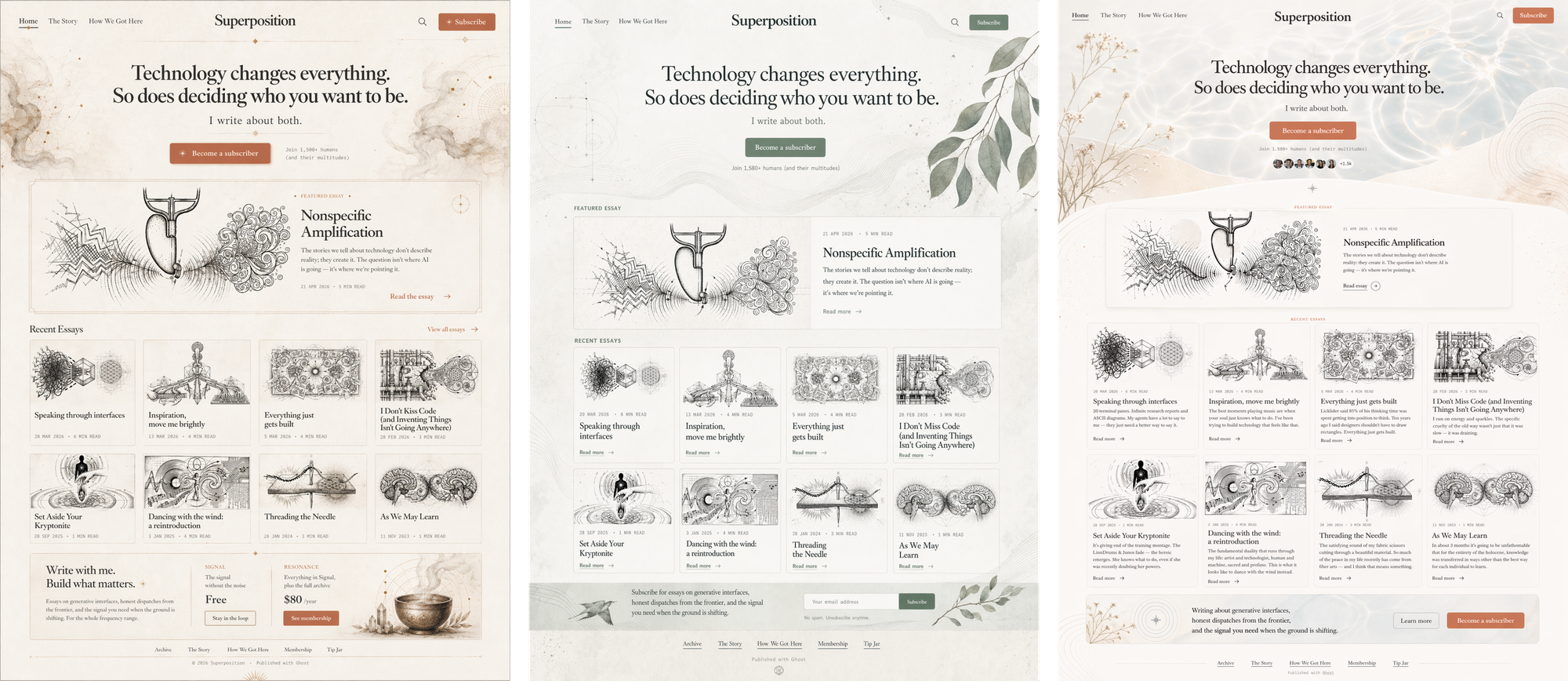
What came back shocked me. Yes, the images were beautiful. But that was not the point. The model had translated embodied experience into design decisions without being prompted with design-y language — the love letter to California that the Manzanita Research brand guidelines call out but Claude never managed to implement.
Whole Earth Catalog meets Laurel Canyon. Analog warmth in digital spaces. Sun-faded, textured, unhurried. Like a workshop with good light and interesting tools on the walls.
The strongest prompts were not visual style tags. They were embodied scenes. "Loose gravel crunching under your tires on a rural dirt road" or "driving back to the city with a little bit of a sunburn and sand in my shoes" does something that hex codes and component libraries can't.
But the prompts weren't random sensory noise. They clustered into categories, each one a different lens for specifying an encounter:
Taste and scent — palo santo, eucalyptus, the first river skinnydip
Weather and atmosphere — marine layer, desert twilight, thunderstorm charge
Material — vellum, chalk, salt-faded linen, oxidized brass
Emotional state — relief after truth, alert serenity, brave tenderness
Social signal — for someone who wants intellect without deadness
Life season — after the tower, early thaw, lucid grief
Each category shapes the page differently. Weather shapes hierarchy and density. Material shapes texture and edge. Social signal shapes who feels recognized.
Some of these feel especially native to Superposition's themes.
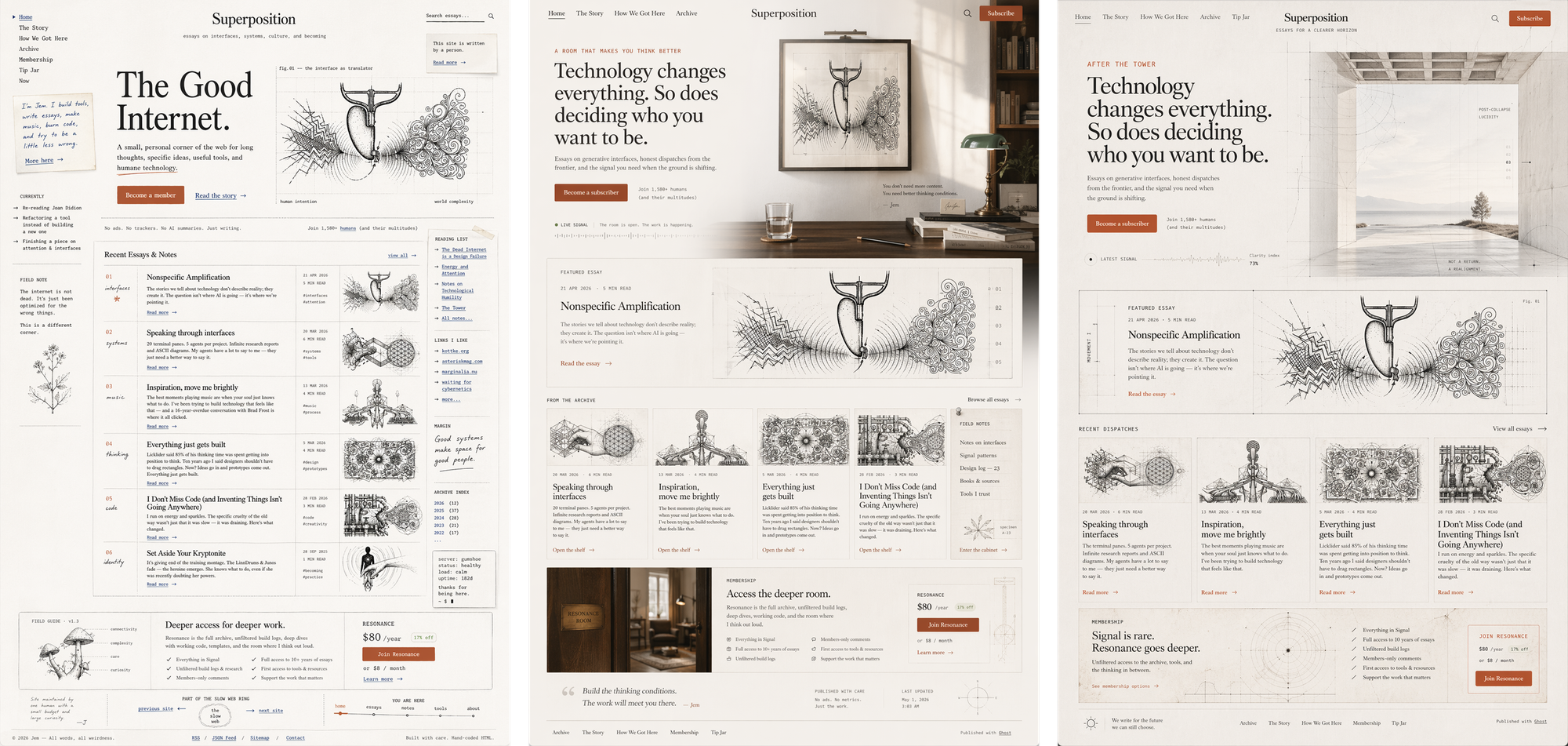
"The good internet"
A corner of the web that still has soul. Hand-touched, literary, breathable, specific. Not engagement-optimized. Not anti-tech either.
"A room that makes you think better"
Intellectual hospitality. Friction removed without flattening mystery. Beautiful restraint. Zero startup grime.
"After the tower"
Post-collapse lucidity. Clean horizon. Surviving the fire without smelling burnt. Seriousness with aliveness still intact.
The variable was not different content, nor was it leaning into design-y prompting language. The variable was a different encounter model.
The Semantic Layer
I'm not arguing that we replace design systems with vibes. Systems still matter. So do tokens, craft, judgment. The coding agents still need to know what to build.
What I'm arguing is that vibe-language should become the generative semantic layer above the system.
The old flow goes system → visuals. You define tokens first, then components, then pages. What I'm proposing is the reverse: sensation → visuals → system. You start with how it feels, generate the visual field, then extract the system from what works.
The model generates possibilities, but taste remains in the loop as judgment. Does this still feel like the intent, or did it collapse into aesthetic costume? Only after a design tastes right do you derive tokens, typography scales, spacing rules, and component behavior. If our design specs only teach the model what the interface is made of, they have already forgotten what the interface is for.
Tokens can encode what a button looks like. They can't encode why it should feel that way. Image models are weirdly good at bridging intention to form.
The future of design specification might not say "use 8px radii." It might say "this should feel like cool air entering a room after smoke has cleared. It should make the reader breathe slower but sit up straighter. It should feel intelligent without becoming sterile, spiritual without becoming decorative, intimate without becoming soft."
That is not less rigorous. It is a different kind of rigor.
The best interfaces leave a residue. You close the tab, but the sand remains between your toes.
- we pioneered code-to-canvas in 2017 so maybe that's why I'm over it ¯_(ツ)_/¯ ↩︎
- Uhhh we did "assembling components in Markdown" in 2017 also, but I digress↩︎
- (probably! unless you're in the future and I've redesigned it! hi!) ↩︎